
UX Design
Dark Patterns in UX: When Good Design Works Against Users

Experience Designer
Dark patterns in UX are often good design pointed the wrong way. Real examples, the ethics, regulation, and how to tell persuasion from manipulation.
₹799. That was the price on the product page, and it was a good price, which is why you tapped Buy.
₹799 on the cart page too. Still fine.
Then the delivery line appears. ₹899. Slightly annoying, but delivery costs money, you reason.
A "platform fee" you have never heard of shows up. ₹949. You squint at it.
Then a toggle, already switched on, for "purchase protection." ₹999.
You have now spent two minutes and 25 percent more than you agreed to, and at no point did anything feel like a scam. Every screen was clean. Every button sat where you expected it. The little green checkmarks were reassuring. You could have turned the toggle off. You could have gone back. You didn't, because the flow was smooth and you were tired, and ₹200 spread across four small moments never felt like ₹200.
If you've felt that, you've met a dark pattern. Probably several, holding hands.
Here is the uncomfortable part. Nothing in that checkout was badly designed. The hierarchy was clear, the page was fast, the copy was friendly. The problem wasn't craft. Someone pointed all that craft at your wallet instead of at your decision.
That is the argument of this article: dark patterns in UX are not necessarily bad design. Very often they are good design pointed in the wrong direction. The same defaults, hierarchy, friction reduction, and persuasive copy that make products pleasant to use can, with a small change of intent, make people do things they never meant to do. Which means the useful question was never "does this design influence the user?" All design influences the user. The useful question is: does this design help the user make a decision, or does it make the decision for them?
What are dark patterns in UX?
The short version: a dark pattern is an interface deliberately designed to get you to do something you wouldn't have chosen if you'd understood what was happening. Buy the insurance. Keep the subscription. Share your contacts. Accept the cookies. The interface wins; you lose a little, or sometimes a lot.
The term comes from UX researcher Harry Brignull, who coined it in 2010 and began cataloguing examples on a site that has since become deceptive.design. His original taxonomy (roach motel, sneak into basket, confirmshaming, privacy zuckering, and friends) gave designers a shared vocabulary that has since walked into law; EU digital regulation, US state privacy law, and India's consumer-protection guidelines all use language that traces back to it.
The terminology has shifted. Brignull himself now prefers "deceptive design" or "deceptive patterns," partly because it names the behaviour more precisely and partly over discomfort with the connotations of "dark." Regulators increasingly say "deceptive" too. I'll use "dark patterns" here because it's still what most people say, but treat the two as the same idea wearing different labels.
Strip away the taxonomy and one thing sits underneath every dark pattern: it attacks your ability to make an informed choice on your own terms. Sometimes it attacks the informed part, by hiding costs or consequences. Sometimes it attacks the choice part, by making one option effortless and the other exhausting. Sometimes it attacks your own terms, by manufacturing fear or shame. Autonomy is the thing being taken. Everything else is technique.
The strange thing about dark patterns
We tend to picture manipulative interfaces as ugly: cluttered banners, blinking buttons, the pop-up that spawns two more when you close it. Some are. But the dark patterns that do the most damage don't look like that at all. They look like the best work in your portfolio.
Consider what a truly effective dark pattern needs. A clear visual hierarchy, so your eye lands on the option the business prefers. Frictionless flow, so you're through the upsell before you think about it. Accessible, legible, well-spaced components, because a confusing interface makes people slow down, and slowing down is fatal to manipulation. Good copy. An A/B test it won. Every item on that list is something we praise in a design review.
The research bears this out. Arunesh Mathur and colleagues' 2019 crawl of roughly 11,000 shopping websites found dark patterns on about 11 percent of them, and found that the more popular the site, the more likely it was to use them. These weren't fly-by-night stores with broken CSS. They were successful, well-resourced companies with the best design talent money could hire.
So the usability lens alone can't catch this. A dark pattern can score beautifully on task completion, time on task, and in-the-moment satisfaction, and still be doing harm, because the "task" it's helping the user complete is the one the business wanted, not the one the user came for. The pattern isn't always the problem. The direction of the pattern is. That reframing moves dark patterns out of the "incompetent designers" bucket and into the "competent designers, pointed wrong" bucket, which is where nearly all of them live.
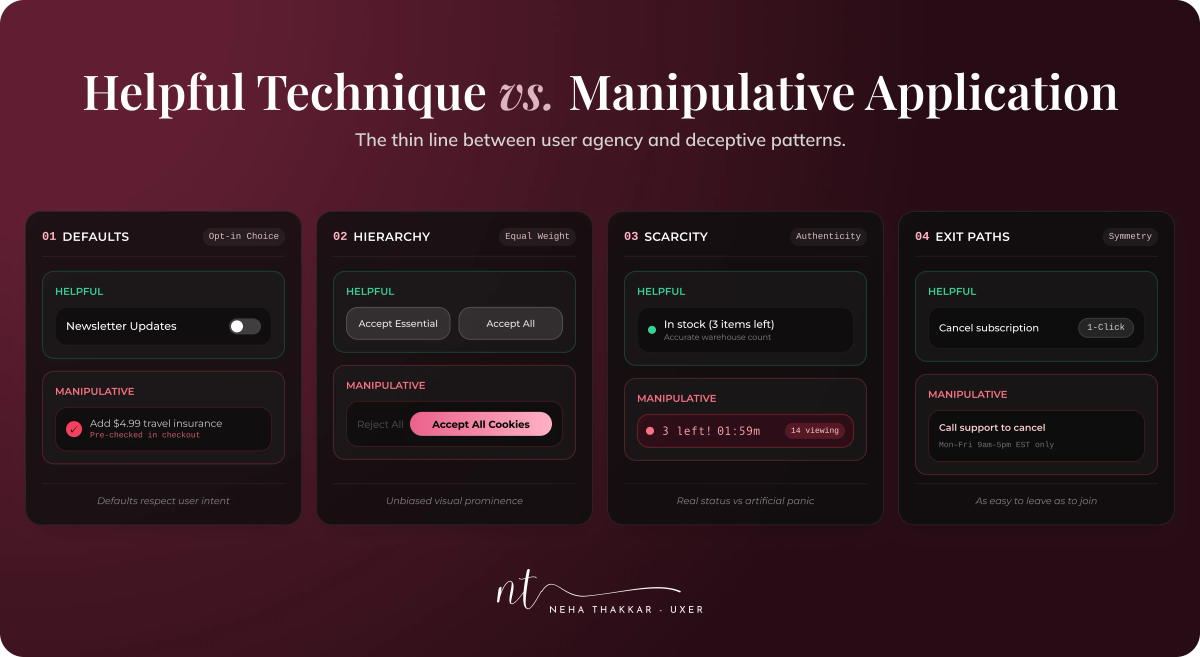
The UX toolbox can become a manipulation toolbox
Almost every technique we use to make products easier can be flipped. Here is the same toolbox, viewed from both sides.
| UX principle | Helpful use | Manipulative use |
|---|---|---|
| Defaults | Pre-select the option most users genuinely want; easy to change | Pre-check paid add-ons, data sharing, or auto-renewal users won't notice |
| Visual hierarchy | Make the primary action for the user's goal obvious | Make the business-preferred option loud and the alternative a grey text link |
| Friction reduction | Remove steps from tasks users want to complete | Remove steps from signup while adding them to cancellation |
| Progressive disclosure | Hide advanced settings until needed | Hide fees, terms, or consequences until after commitment |
| Social proof | Show real reviews and honest usage numbers | Fake "12 people are viewing this" or invented testimonials |
| Scarcity and urgency | Communicate genuine low stock or a real deadline | Countdown timers that reset; "only 1 left" that never changes |
| Personalization | Surface relevant products and settings | Target vulnerable moments or users with pressure tactics |
| Notifications | Alert users to things they care about | Nag repeatedly until the user gives in to make it stop |
| Confirmation dialogs | Prevent destructive mistakes | Add confirmation only to the exit path; shame the decline |
| Choice architecture | Structure options so decisions are easier | Structure options so one is nearly impossible to find or understand |
Nothing in the left column is unethical. Nothing in the right column is a different mechanism. What changed between the columns is context, transparency, user control, and who bears the consequences.
A useful way to see how a technique got flipped comes from the same Mathur study, which classified dark patterns by attribute. A pattern can be asymmetric (unequal effort or prominence between choices), covert (steering the user without their awareness, often by leaning on the cognitive biases these techniques exploit), deceptive (creating a false belief), information-hiding (delaying or obscuring what the user needs to know), or restrictive (removing options entirely). This lens beats any list of named patterns because it tells you what was done to the decision. When a review gets stuck on whether something "counts," asking "which of these five is it doing?" usually ends the argument.
Common UX dark patterns
Rather than march through a numbered list, it helps to group dark patterns by what they manipulate. There are four families. Each is a legitimate technique with its compass reversed.
Family 1: Hiding information
These attack the informed part of informed choice.
Hidden costs and drip pricing. The opening of this article. Fees appear step by step so the total is never visible until you're committed. It works through anchoring (₹799 is the number in your head) and sunk effort (you've already typed your address). The business gets a higher effective price behind a lower sticker price; the user loses the ability to compare honestly and pays for things they'd have declined upfront. Baymard Institute's checkout research consistently finds unexpected extra costs at or near the top of reasons people abandon carts, so this one quietly bleeds the business too. India's CCPA guidelines name drip pricing explicitly. The ethical alternative is boring and effective: show the all-in price early, or at least the fee structure before the user invests effort.
Disguised advertising. Ads styled to look like content, navigation, or a "Download" button. It works because users trust the visual grammar of the interface they're in. The business gains clicks it didn't earn; the user loses trust in every button afterward. The alternative: label ads clearly and let them look like ads.
Bait and switch. The user sets out to do one thing and the interface delivers another: a "Close" X that installs the upgrade, a "free" plan that turns out to require a card. It works by exploiting learned expectations. The alternative is simply that buttons should do what they say.
Family 2: Rigging the choice
These attack the choice part. Options exist, but the presentation has already decided.
Preselected add-ons and sneak into basket. Insurance, "priority processing," a donation, a warranty, already ticked. It works because of the default effect and status quo bias: unticking requires noticing, understanding, and acting. The business gains attach-rate; the user gains a charge they didn't choose. India's June 2025 CCPA advisory pushed platforms to audit precisely this, and the pre-ticked box is often the first thing to go. The alternative: unchecked by default, or an explicit opt-in step where the value is actually explained.
Interface interference and false hierarchy. The "Accept all" button is a big blue pill; "Manage preferences" is eleven-pixel grey text. Both options exist. One has been dressed for the party. This works through visual hierarchy, the very tool we use to help. The alternative is symmetry: equally weighted choices where the decision is genuinely the user's.
Trick questions and trick wording. "Uncheck this box if you do not wish to not receive updates." Double negatives, reversed checkboxes, toggles whose on-state is ambiguous. It works because people skim and answer the question they think they were asked. The alternative: plain language, one negation maximum, and a consistent meaning of "on."
Family 3: Weaponizing effort
These make the business-preferred path effortless and the user-preferred path exhausting.
The roach motel and obstructed cancellation. Easy to get in, hard to get out. The best-documented example is Amazon Prime's cancellation flow, which the company internally called "Iliad" and which the US Federal Trade Commission described as a four-page, six-click, fifteen-option journey laced with discount offers and benefit reminders. Amazon settled with the FTC in September 2025 for $2.5 billion, including $1.5 billion in refunds. The pattern works because effort is asymmetric and present bias makes "I'll cancel later" feel rational. The business keeps the revenue; the user pays for something they no longer want. The alternative: cancellation that takes about as many steps as signup. If your user needs the archaeological skills of Indiana Jones to leave, something has probably gone wrong.
Forced continuity and subscription traps. A free trial that quietly becomes a paid plan, with no reminder before the charge. It works through inattention and the endowment effect (you already have the features, so losing them stings). India's guidelines call this a "subscription trap" and separately list "SaaS billing" practices. The alternative: a reminder before the trial ends and a one-tap cancel.
Forced action and forced enrollment. Create an account to see a price. Grant contacts access to send one message. Accept all cookies or leave. It works because the user wants the thing on the other side of the gate. The alternative: ask for the minimum needed, when it's needed, with a real way to decline.
Nagging. The same request, again, every session, with "Not now" but never "No." The European Commission's 2022 study of popular sites and apps found repeated requests among the most common deceptive patterns. It works by attrition: eventually saying yes is cheaper than saying no forever. The alternative: a real "No," honoured.
Family 4: Exploiting emotion
These attack your own terms, by making the decision about fear or shame rather than value.
False urgency and fake scarcity. "Only 2 left!" "Deal ends in 09:58!" "17 people are looking at this!" In the Mathur crawl, urgency and scarcity messages were among the most frequently observed patterns of all. They work by short-circuiting deliberation. The business gains faster conversion; the user loses the time to think and often overpays. The alternative: show real stock and real deadlines, and show nothing when neither is true.
Fake social proof. Invented reviews and fabricated activity feeds. Real social proof reduces uncertainty; the fake kind manufactures it. The alternative is increasingly a legal requirement anyway: only show what's real.
Confirmshaming. The decline button that insults you. This one deserves its own section.
Cross-cutting: privacy manipulation
Consent interfaces are where all four families meet. Hidden data uses (information), "Accept all" in bold with "Reject" buried three clicks deep (rigging), re-asking every visit (effort), and "Are you sure you want a worse experience?" (emotion). Brignull originally called this "privacy zuckering." European data-protection regulators and the FTC's 2022 report both single out consent flows, and for good reason: consent that was engineered isn't consent.
The "No" button deserves a personality
Somewhere along the way, declining an offer became a moral event.
"No thanks, I don't want to save money." "I'd rather pay full price." "No, I don't care about my skin." "Skip and lose my rewards."
This is confirmshaming, and it's worth dwelling on because it shows how much work copy can do. Structurally, it's a plain binary: accept or decline. But the decline has been rewritten as a confession. You aren't saying no to a newsletter; you're announcing, to the interface and to yourself, that you are the kind of person who doesn't care about saving money. A tiny dose of guilt (I'm being wasteful), shame (I'm being judged), and fear (am I about to miss out?), delivered in six words.
The false binary is the quieter trick. Often the real options are broader than the two buttons suggest: "remind me later," "show me the terms first," "yes, but not by SMS." Collapsing all of that into "Yes" versus "I am a bad person" is a rigged vote dressed as a simplification.
The ethical alternative is disarmingly plain: give the No button the same dignity as the Yes button. "No thanks." "Not now." "Maybe later." Users who decline with dignity come back. Users who were shamed into a yes unsubscribe with prejudice.
Dark patterns don't always feel dark
Here is the part most articles miss, and it may be the most important part.
When people imagine being manipulated, they imagine feeling it: the flash of anger at the reset timer, the "wait, what?" at the surprise charge. But the most effective dark patterns produce no such moment. The experience is closer to a small internal shrug. Fine, I guess I'll click this. You accept the default because it's already selected. You take the highlighted option because it's highlighted. You don't look for the alternative because nothing suggested there was one. Nothing was hidden, exactly. It just wasn't shown.
This isn't speculation. Jamie Luguri and Lior Strahilevitz ran a large controlled experiment with a representative sample of US consumers, exposing groups to no dark patterns, "mild" ones (a default, some visual prominence, a bit of confirmshaming), or "aggressive" ones (obstruction, nagging, pressure). The control group accepted an unwanted paid service 11.3 percent of the time. The mild group: 25.4 percent, more than double. The aggressive group: 37.2 percent. The striking finding was what happened to trust. Aggressive patterns triggered a backlash; people noticed and were annoyed. Mild patterns produced almost no backlash at all. They doubled compliance and left no fingerprints. The study also found less-educated participants were markedly more susceptible to the mild patterns, which should end any argument that "users can just read carefully."
So the subtle mechanics deserve their own inventory:
- Defaults that quietly decide for you.
- Visual prominence that makes one path obvious without hiding the other, exactly.
- Hidden alternatives, present but placed where no one looks.
- Friction asymmetry: three steps in, nine steps out, each individually reasonable.
- Confusing copy that isn't quite deceptive but isn't quite clear.
- Progressive disclosure that reveals the important thing only after the commitment.
Individually, each of these is a legitimate design decision. That's what makes them dangerous. Nobody in the review will say "this is manipulative," because nothing in isolation is. The manipulation lives in the accumulation and the direction, which is why "we tested it and satisfaction didn't drop" is no defence. Satisfaction didn't drop because the users didn't know what happened to them.
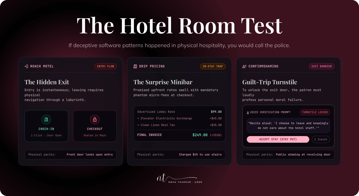
The Hotel Room Test
I find it helps to move the interface into the physical world, where our instincts are better calibrated. Call it the Hotel Room Test. It's a mental model I built for this article, not an established framework, so take it for what it's worth.
Imagine your product is a hotel. Would you:
- Hide the exit, so guests wander the corridors looking for a way out? (Roach motel.)
- Make check-in a single friendly handshake and check-out a maze of locked doors and a form in triplicate? (Obstructed cancellation.)
- Stock the minibar with items that only appear on the bill at departure? (Drip pricing.)
- Hang an "Only 1 room left!" sign in the lobby of a half-empty hotel? (Fake scarcity.)
- Light one door in the hallway, leave the other unmarked, and call that a choice? (False hierarchy.)
- Have the concierge ask you the same question every time you cross the lobby, accepting only "not now"? (Nagging.)
- Issue a key card that silently extends your stay another week unless you locate the front desk? (Forced continuity.)
- Disguise a marketing-consent form as the guestbook? (Privacy manipulation.)
- Put a sign on the exit that reads "No thanks, I don't value my safety"? (Confirmshaming.)
Every one of these would earn a hotel a one-star review and possibly a visit from a regulator. Nobody would defend it as "just good hospitality design." Yet the digital versions ship every day, get celebrated in growth decks, and get copied by competitors.
So the interesting question is why these things feel obviously wrong in a lobby and merely debatable on a screen. A few honest answers. In a lobby there's a witness: a person watching your face while they explain the minibar charge. Screens have no witness, and shame needs one.
In a lobby the business pays a physical cost for the trick (the argument at the desk); on a screen the cost is a support ticket someone else will read. Screens are fast and abstract, so ₹200 across four steps never feels like ₹200 at once. And A/B testing normalizes drift: no single experiment builds the maze, each one just adds a door that "won." Six quarters later you've built the Iliad, and nobody remembers deciding to.
Persuasive design isn't the enemy
It's worth saying clearly, because the ethics conversation sometimes drifts into a fantasy of neutral design: there is no such thing as an interface that doesn't influence behaviour. Where you put the button influences behaviour. What you call it influences behaviour. What's on screen first influences behaviour. If you're designing, you're persuading. The only questions are toward what, and how.
A vocabulary helps. To inform is to give the user what they need to know. To guide is to make the path to their goal clear. To persuade is to make an honest case for an option. To nudge is to shape the choice architecture so the better option is easier while every option stays open. (Richard Thaler, who popularized the term, insists a nudge must be transparent, easy to opt out of, and aimed at the person's own welfare; when it fails that test he calls it sludge.) To pressure is to raise the cost of saying no. To deceive is to create a false belief. To coerce is to remove the real ability to refuse.
The first four are the job. Recommending a safer default configuration, explaining why a feature is worth enabling, reminding someone about the half-finished setup they'll benefit from, collapsing a twelve-option decision into a sensible three: all persuasion, all good. Users are not harmed by influence. They are harmed by influence that takes something from them without their understanding. Persuasion was never the issue. Whether the user's autonomy survives it is.
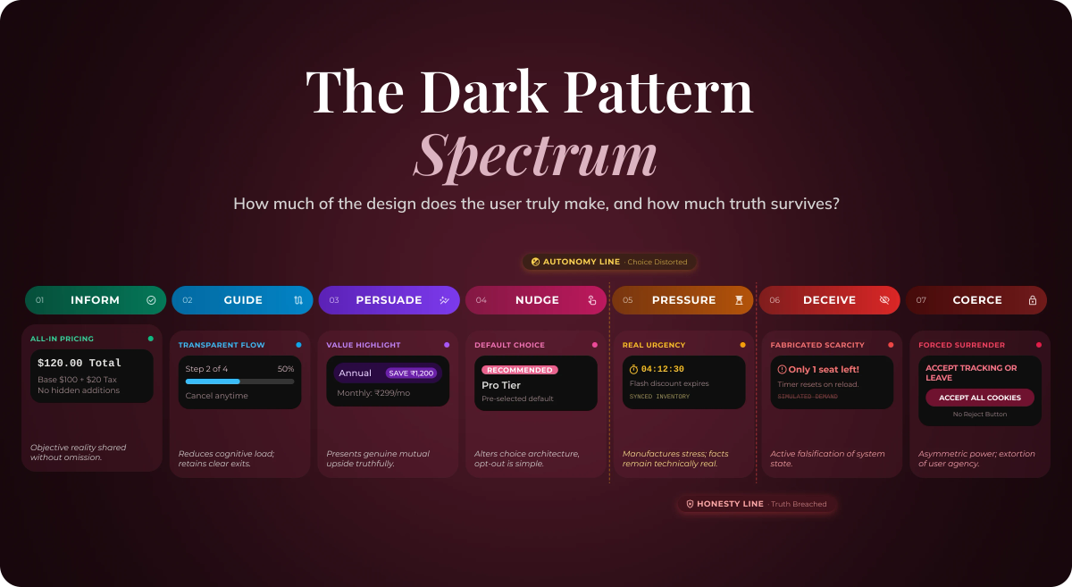
The Dark Pattern Spectrum
Put that vocabulary in order and you get a spectrum. I offer it as a practical design mental model, not an academic framework, and I'd draw it like this:
INFORM → GUIDE → PERSUADE → NUDGE → PRESSURE → DECEIVE → COERCE
The axis running underneath is how much of the decision the user consciously makes versus how much the interface makes for them, together with how much true information survives the journey. Reading left to right:
- Inform: the all-in price, shown upfront.
- Guide: the progress bar; the clear primary action for the user's own task.
- Persuade: "Annual saves you ₹1,200," true and openly stated.
- Nudge: the sensible plan pre-selected, alternatives visible and one tap away.
- Pressure: a countdown on a real deadline; a reminder of what you'll lose.
- Deceive: a countdown on nothing; "only 1 left" of an infinite digital good.
- Coerce: accept all or lose access; the cancel button that doesn't exist.
Two lines cut across this spectrum, and they're the useful part.
The Autonomy Line falls between Nudge and Pressure. To the left, the user can still freely say no; the design has only made yes easier. To the right, the design starts making no expensive.
The Honesty Line falls between Pressure and Deceive. To the left, everything on screen is true, even if it's pushy. To the right, the user is deciding inside a false picture of reality.
Pressure, sitting between the two lines, is the genuinely grey zone: a real deadline is legitimate pressure, nagging is not. The spectrum locates the technique; only context locates the ethics, which is why teams need a test rather than a rulebook. We'll get to that.
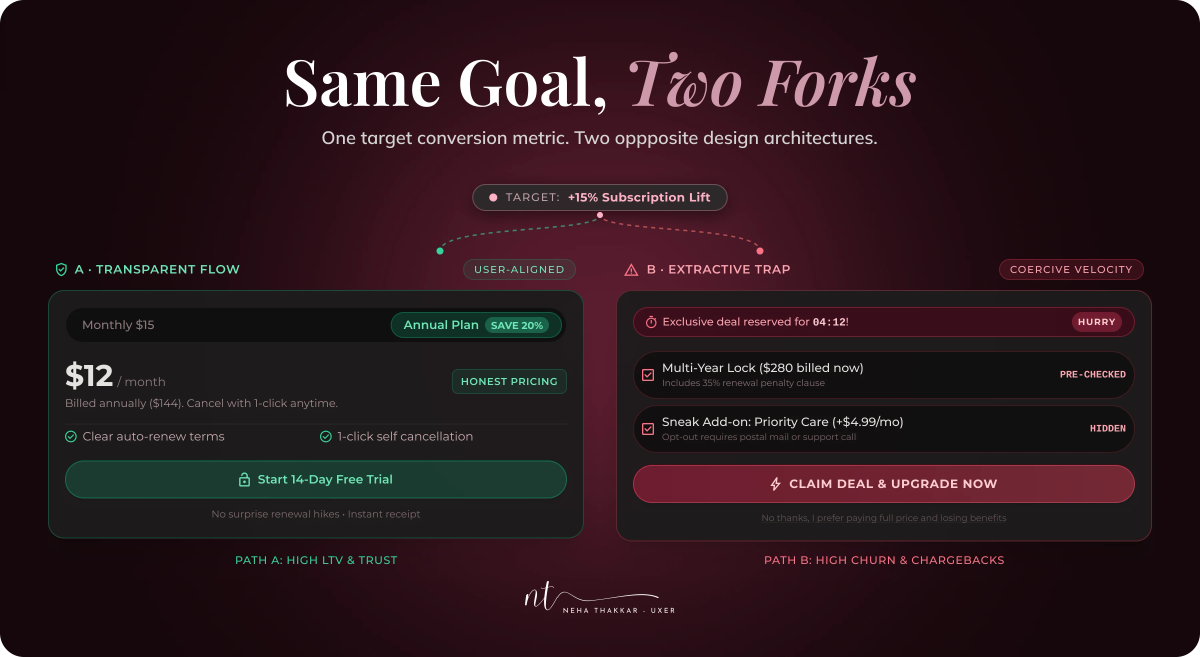
The metric that turns into a dark pattern
Now the part that matters most if you actually build products.
Dark patterns almost never start as dark patterns. They start as a number on a slide. "Increase subscription conversion by 15 percent this quarter." A completely reasonable goal, set by reasonable people.
Imagine two teams handed that goal. The first team asks why people don't convert. They discover the pricing is confusing, the value of the paid tier isn't obvious, onboarding stalls before users reach the moment the product clicks, the trial is too short to matter, and checkout is slow on mobile. So they clarify the pricing, rewrite the value copy, fix the onboarding gap, extend the trial, and speed up the page. Conversion rises.
The second team asks how to get more people to click Subscribe. They pre-select the annual plan, add a "Most popular" badge to the tier with the best margin, put a countdown on the trial, move the cancel link into account settings behind two menus, and rewrite "No thanks" as "I don't want to grow my business." Conversion rises.
Both teams hit 15 percent. Both get the bonus. On the dashboard they are indistinguishable. Only one of them made the product better.
The difference is a distinction I think every product team should keep somewhere visible: optimizing user outcomes versus optimizing user behaviour. The first team improved the user's situation, and conversion followed as a side effect. The second team improved the number directly, acting on the user's behaviour without regard to whether their situation improved. Both are "data-driven." Only one is user-centred.
This is where the standard metrics quietly turn. Conversion optimized for behaviour becomes pressure at the point of purchase. Activation becomes forced enrollment and permission grabs on first launch. Retention becomes obstructed cancellation, because a user who can't leave "retains." Click-through rate becomes disguised ads and misleading buttons. Session duration and engagement become infinite feeds and nags engineered for compulsion rather than value; whether that crosses into a dark pattern is genuinely debated in the research, but the incentive gradient is obvious. Subscription conversion becomes pre-selected annual plans and trials that convert on silence.
None of those metrics is wrong to track. The failure is treating them as the goal rather than as evidence of a goal. Retention is supposed to be evidence that people find value. Generate it by hiding the exit and the number still goes up, but it has stopped meaning anything; you're now measuring how good you are at trapping people.
There's a practical test for a team. For any metric you're pushing, ask: would this number still go up if the user fully understood what we did? Clearer pricing passes. A hidden cancel link does not. That question sits right on the fault line between what users want, what they need, and what the business needs.
Dark patterns aren't always intentional
It would be tidier if dark patterns required a villain. They usually don't.
Here is how they actually get built. A goal comes down: reduce trial churn. A PM writes a KPI: trial-to-paid conversion. A designer proposes five experiments; one is "add a reminder of what you'll lose on the cancel screen." A reasonable idea, since people should know what they're giving up. It wins by four points. Next quarter, someone tests adding a discount offer to the cancel flow. Also reasonable, also wins. Then a second confirmation step, "to prevent accidental cancellations." Wins. Then the cancel entry point moves under "Manage membership," because the settings navigation was cluttered anyway. Nobody objects. Then the button copy changes from "Cancel" to "Continue to cancel" to "I still want to cancel," each variant winning a sliver.
Eighteen months later, cancellation is a four-page, six-click, fifteen-option journey. No one in any of those meetings said "let's trap people." Every individual decision was defensible. The dark pattern is an emergent property of a system that measured behaviour and rewarded whatever moved it.
That's the honest shape of the problem: business goal → KPI → experiment → winning variant → optimization → unintended consequence. It's also why "just hire ethical designers" isn't a solution. The designers in that story were ethical. The system had no step where anyone was asked to look at the accumulated whole instead of the incremental change. If ethics lives anywhere in the design thinking process, it has to live there: at the review of the whole flow, not the review of the variant.
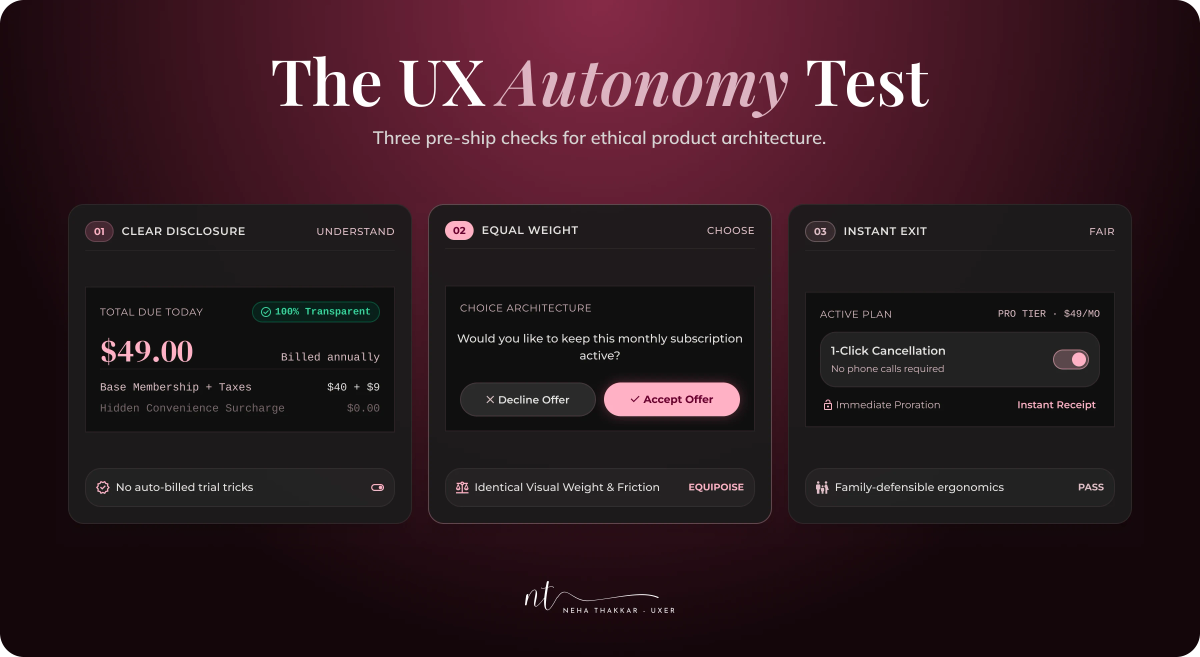
The UX Autonomy Test
Which brings me to the tool I'd actually put in front of a team before shipping any persuasive interaction. I call it the User Autonomy Test. Like the Hotel Room Test, it's a mental model developed for this article rather than a published framework, and I've grouped the questions so they're easier to carry around.
Understand: can the user see clearly?
- Can the user understand what will happen?
- Are the important consequences visible before they commit?
- Would this still feel fair if the user knew exactly why we designed it this way?
Choose: is the user actually free? 4. Can the user reasonably say no? 5. Are the alternatives genuinely available and findable? 6. Have we made one option intentionally harder? 7. Can the user change their mind afterward? 8. Would we design the reverse action (cancel, opt out, downgrade) with the same care as the forward one? Call this the symmetry question; it catches roach motels before they're built.
Fair: who carries the cost? 9. Who benefits from this interaction, and who bears the risk if it goes wrong? 10. Are we relying on fear, confusion, urgency, or vulnerability to make it work? 11. Does the design still treat someone fairly when they're rushed, distracted, on a small screen, or less digitally literate? Luguri and Strahilevitz's finding that mild patterns hit less-educated users hardest is the reason this question exists.
The rule that makes it useful: a "no" on any question in Understand or Choose is a stop, not a discussion. The Fair questions are where the genuine debates happen, and they should.
The designer is not the only person responsible
It's tempting to pin dark patterns on the designer, since the designer drew the screen. But look again at the story above. The designer proposed one reasonable variant. The PM chose the metric. Leadership set the target and the deadline. The growth team ran the experiments and celebrated the wins. Engineering built what was specified. Marketing wrote the urgency copy. Research, if it existed, was asked to measure conversion, not comprehension.
Dark patterns are systemic. They live in how goals get set, how success gets defined, and what gets reviewed. So the fixes are systemic too. Product managers can pair every behavioural metric with an outcome metric (conversion and 30-day refund rate; retention and "how easy was it to cancel?"). Leadership can decide that some numbers are not allowed to go up by certain means, and say so out loud. Design reviews can add one recurring question: "walk me through the exit." Research can own comprehension as a metric, not just completion. Engineers can flag when they're asked to make one path slower than another. None of this requires heroics. It requires the accumulated whole to be somebody's job.
How UX research can detect dark patterns
Research is the natural immune system here, because dark patterns are, at bottom, comprehension failures that happen to benefit the business, and comprehension is exactly what good UX research methods measure.
The signals are already in your data if you look. In funnel analysis, a step with high completion but a downstream spike in refunds, chargebacks, or support tickets is a step where people didn't understand what they did. In cancellation behaviour, a long, low-completion cancel flow paired with a pile of "how do I cancel" tickets is a roach motel wearing a metrics costume. Session recordings show the hesitation, the cursor hovering over the grey link before giving up. Support tickets and complaints are the most honest research you never had to recruit for; "I didn't know I was being charged" is a finding.
Then there's what you can test directly. Usability and comprehension testing can ask people, after a flow, what they just agreed to and what it will cost, then compare their answer to reality. Interviews can probe whether users felt pressured or knew they had options. Documenting these as discrete, reusable findings (the atomic research approach) matters more than usual here, because comprehension failures are exactly the evidence that evaporates when the team that found them moves on.
The research questions worth asking of any persuasive flow:
- Did users understand what they were agreeing to?
- Did they know there was another option?
- Did they understand the consequences, including cost and reversibility?
- Did they feel pressured, rushed, or judged?
- Could they reverse the decision, and did they know how?
- Did the interface communicate honestly, by their account rather than ours?
If a flow converts well but users can't answer the first three, you don't have a well-designed flow. You have a well-designed trap that hasn't been caught yet.
What good persuasive UX looks like
The positive version is less dramatic and more durable.
Make the value clear before asking for commitment, in plain language, with the real price. Reduce unnecessary decisions: collapse twelve plans into three, and if choice overload is stalling people, fix the choice architecture rather than pushing harder. Provide honest defaults, set to what most users would choose if they thought about it, and make changing them one obvious step. Communicate consequences at the moment they matter: "Your trial ends Friday. We'll charge ₹499 unless you cancel" is persuasion and respect in one sentence. Make choices reversible, and say so; reversibility is the cheapest way to lower the fear that pressure tactics feed on. Preserve control: a real "No," honoured, and never re-asked every session.
Use social proof truthfully and specifically ("4.6 from 2,300 reviews" beats "loved by millions"). Communicate genuine urgency and stay silent when there isn't any; a timer you only show when it's real becomes a timer people believe. And make cancellation as understandable as signup, following the conventions users already know: if someone can find Subscribe in two seconds, they should find Cancel in about two seconds too.
None of that is timid. Clear, honest, well-structured persuasion converts. It just converts people who meant to.
Where should UX draw the line?
I'd like to end with a clean rule for where dark patterns in UX begin, and the honest answer is that there isn't one line. There are several, and they don't always agree.
Autonomy asks whether the user could freely have chosen otherwise. Transparency asks whether they could see what was happening. Informed choice asks whether they understood the consequences. Reversibility asks whether a wrong choice can be undone. Fairness asks who benefits and who carries the risk. Most of the time these point the same way. Sometimes they don't: a perfectly transparent flow can still pressure, and a reversible one can still deceive in the moment.
Business incentives complicate it further, and pretending otherwise is naïve. Teams are measured on behaviour, and behaviour is easier to move by force than by value. Vulnerable users complicate it more: a pattern that a confident, unhurried person shrugs off can land hard on someone tired, anxious, older, or new to the internet, and products are used by all of those people. The regulatory direction, at least, is unambiguous even where details vary. In the US, the FTC enforces against deceptive and unfair design under existing law (its standalone "click-to-cancel" rule was vacated in court in 2025, but enforcement continued, as Amazon learned). The European Commission found deceptive patterns on 97 percent of the popular sites and apps it studied and is drafting a Digital Fairness Act. India's Central Consumer Protection Authority named thirteen dark patterns as unfair trade practices in its 2023 guidelines, then in June 2025 gave more than fifty platforms three months to audit themselves, with Flipkart among the first to declare compliance publicly. Whether a given pattern is illegal depends on where you are and exactly what it does. Whether it's worth the risk increasingly does not.
So here is the principle I'd offer, developed rather than sloganed. Good UX has never been about removing persuasion. Every button persuades. Good UX removes deception: the false picture, the hidden cost, the exit you can't find, the no that costs more than yes. It leaves the user holding the decision. If the design helped them decide, it was persuasion. If the design decided for them, it was something else, no matter how beautiful the screen.
The test, in the end, is the one from the beginning. Does this help the user make a decision, or does it make the decision for them? Ask it at the review of the whole flow, not just the variant. Ask it about the exit as carefully as the entrance. And ask it as the tired person at 11 p.m. with ₹799 in their head and ₹999 on the screen, because that's who is actually using the thing.
Frequently asked questions
Dark patterns (increasingly called deceptive patterns or deceptive design) are interface designs that lead people to do things they wouldn't have chosen if they'd understood what was happening: buying add-ons, keeping subscriptions, sharing data, or accepting terms. The term was coined by UX researcher Harry Brignull in 2010. What unites every dark pattern is that it undermines the user's ability to make an informed choice on their own terms.
Hidden costs and drip pricing, pre-selected add-ons and sneak-into-basket, hard-to-find cancellation (the "roach motel"), free trials that silently convert to paid plans, false urgency and fake scarcity, confirmshaming ("No thanks, I don't want to save money"), trick questions, disguised ads, nagging, and consent banners that make "Accept all" easy and "Reject" hard. The FTC's action against Amazon Prime's "Iliad" cancellation flow is the most prominent recent public example.
All design persuades. Persuasive design makes an honest case and leaves the user free to decline; a dark pattern removes the information or the freedom needed to decide. A useful test: would the user still make the same choice if they fully understood what the interface was doing and why? Persuasion passes; manipulation doesn't.
It depends on the jurisdiction and the specific pattern, so treat this as orientation rather than legal advice. In the US, the FTC pursues deceptive and unfair design under existing consumer-protection law (its dedicated click-to-cancel rule was vacated in court in 2025, but enforcement continued, including a $2.5 billion Amazon settlement and a $245 million Epic Games settlement). In the EU, deceptive patterns are addressed through consumer law, the Digital Services Act, and GDPR, with a Digital Fairness Act in development. In India, the CCPA's 2023 guidelines classify thirteen dark patterns as unfair trade practices under the Consumer Protection Act, 2019. Many patterns are unlawful somewhere; nearly all carry rising regulatory risk everywhere.
Usually because they work on short-term metrics and rarely because anyone decided to deceive. A goal becomes a KPI, the KPI becomes experiments, and whichever variant moves the number wins, one small step at a time. The result can be manipulative even when no individual decision was.
Design the exit with the same care as the entrance, show all-in costs early, use honest defaults, give the decline option equal dignity, and run a comprehension check on any persuasive flow: can users say what they agreed to and what it costs? Pairing behavioural metrics with outcome metrics (conversion with refund rate, retention with ease-of-cancel) makes manipulation visible on the dashboard.
Ask what the design is doing to the decision. Researchers describe five tells: is it asymmetric (one option much easier or louder), covert (steering without awareness), deceptive (creating a false belief), information-hiding (delaying what you need to know), or restrictive (removing options)? If a design does any of these in the business's favour and against the user's, you're looking at a dark pattern, however polished it is.