
UX Design
Decision Paralysis in UX: Why too many choices freeze your users

Experience Designer
Decision paralysis in UX explained: how choice overload and cognitive load freeze users, plus choice architecture tactics and real examples to simplify decisions.
A deep, example-packed guide to decision paralysis in UX: the psychology of choice overload, why more options often means fewer conversions, and the choice architecture tactics that turn frozen users into confident ones.
Who this is for: UX and product designers, PMs, founders, marketers, researchers, and anyone whose users keep "thinking about it" and never deciding. The one-sentence version: When you give people too many choices, they often make no choice at all, and decision paralysis is the quiet conversion killer hiding in your product.
The night you couldn't pick a show
It's 9 PM. You've got a free evening and a streaming subscription with roughly forty thousand titles. You open the app, full of hope. Forty minutes later, you've watched twelve trailers, added three things to your list, and finally... turned off the TV and went to bed. You didn't watch anything. You had infinite choice and somehow ended up with nothing.
Welcome to decision paralysis, the strange, deeply human phenomenon where having more options makes it harder, not easier, to decide. And it isn't just a Netflix problem. It's happening in your product right now: on your pricing page, in your onboarding, in that settings screen with forty toggles, in the checkout flow with too many upsells. Every place you offer users a choice is a place decision paralysis can creep in and quietly kill your conversions.
The good news? Decision paralysis is predictable, and once you understand the psychology behind it, it's fixable. This guide will show you exactly why too many choices freeze people, how to spot decision paralysis in your own product, and the practical choice architecture tactics that help users decide with confidence. Let's dig in.
What is decision paralysis in UX?
Decision paralysis (also called analysis paralysis or choice paralysis) is the state where a user faces so many options, or such complex ones, that they become overwhelmed and unable to decide, often abandoning the decision entirely.
In a UX context, decision paralysis is what happens when your interface asks users to make a choice that's harder than it needs to be, whether because there are too many options, the options are hard to compare, the stakes feel high, or the information is overwhelming. Instead of choosing, the user hesitates, second-guesses, procrastinates, or leaves.
Here's the counterintuitive heart of it: we think we want more choices, but more choices frequently make us less happy and less decisive. Offering users a huge menu of options feels generous and user-friendly. In reality, beyond a certain point, every additional option adds cognitive load, increases anxiety about making the "wrong" choice, and pushes users toward the easiest decision of all: not deciding.
Decision paralysis sits at the intersection of several ideas in UX psychology, choice overload, cognitive load, and choice architecture, so let's unpack the science before we get to the fixes.
The psychology: why too many choices backfire
Choice overload and the paradox of choice
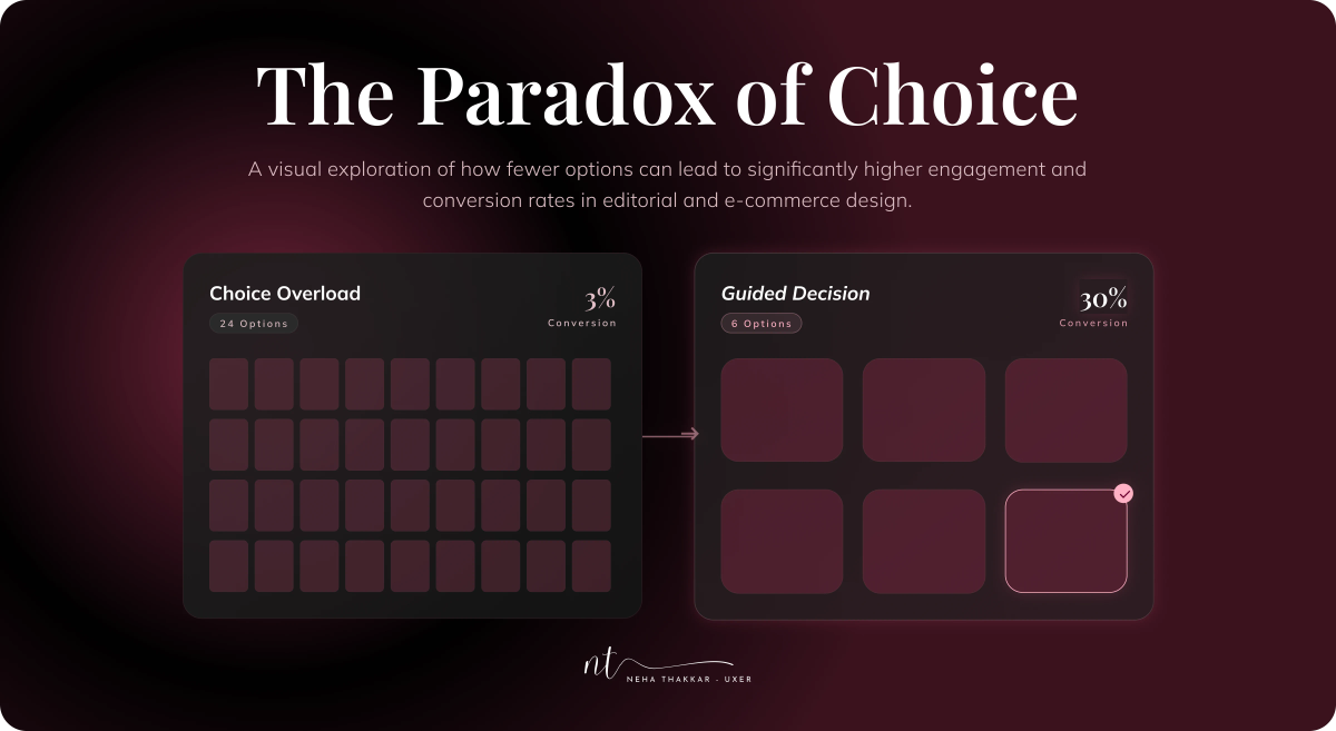
The core concept is choice overload (popularized by psychologist Barry Schwartz as "the paradox of choice"): while some choice is motivating and empowering, too much choice becomes demotivating and stressful. Freedom to choose is good; drowning in options is not.
The most famous demonstration is the jam study. Researchers Sheena Iyengar and Mark Lepper set up a tasting booth in a grocery store. Sometimes they displayed 24 varieties of jam; other times, just 6. The large display attracted more browsers, but here's the kicker: only about 3% of people at the 24-jam table actually bought jam, versus around 30% at the 6-jam table. Fewer choices produced roughly ten times the sales. More options drew a crowd but froze it.
Cognitive load: your users' brains have limits
Every decision consumes mental energy. Cognitive load is the total amount of mental effort a task demands, and human working memory is famously tiny (recall Miller's "seven, plus or minus two" items). When you pile on options, comparisons, and information, you overload that limited capacity. An overloaded brain doesn't work harder; it shuts down, defers, or defaults to the path of least resistance, which is usually inaction.
Hick's Law: more options, slower decisions
There's even a rule for it. Hick's Law states that the time it takes to make a decision increases with the number and complexity of the choices. More options literally means slower decisions, and slow decisions are where hesitation, doubt, and abandonment live. (Hick's Law is one of the Laws of UX worth knowing by heart.)
The fear of the wrong choice
Finally, there's an emotional layer. More options means more potential for regret, "what if I pick this plan and the other one was better?" This anticipated regret raises the stakes of every choice and makes users reluctant to commit. Ironically, the more carefully you let people optimize, the more anxious and paralyzed they can become. Psychologists call the people most prone to this "maximizers" (who exhaustively seek the best) versus "satisficers" (who happily pick the first good-enough option). Great UX helps everyone satisfice.
Why decision paralysis matters (the business case)
If you need to convince a stakeholder that decision paralysis is worth designing against, here's the argument in plain business terms.
It kills conversions. Every moment of hesitation is a moment users can drop off. The jam study wasn't a psychology curiosity; it was a 10x difference in sales. Overwhelming pricing pages, bloated onboarding, and cluttered checkouts leak revenue at exactly the points where you most need users to act.
It increases abandonment. A user who can't decide doesn't politely wait, they close the tab, abandon the cart, or "come back later" (which usually means never). Decision paralysis is a silent contributor to funnel drop-off that analytics show as a mysterious cliff.
It lowers satisfaction, even when users do choose. Choice overload doesn't just reduce decisions; it reduces happiness with the decisions people do make. Users who agonized over too many options are more likely to second-guess, regret, and feel dissatisfied, which hurts retention and loyalty.
It erodes trust and confidence. A product that constantly makes users feel confused or uncertain doesn't feel trustworthy. A product that makes decisions feel easy and confident does. Reducing decision paralysis is, at its heart, about respecting your users' limited time and attention.
In short: fighting decision paralysis isn't about dumbing things down. It's about removing the friction between a user and the action they already want to take.
Signs your product has a decision paralysis problem
How do you know decision paralysis is happening? Watch for these tells, in your analytics and in your usability sessions:
- High drop-off at a decision point (pricing page, plan selection, product listing, or a settings-heavy screen).
- Users lingering unusually long on a screen without progressing, hesitation is often paralysis in disguise.
- Lots of back-and-forth between options or pages, comparing endlessly without committing.
- Support tickets or feedback saying "I wasn't sure which one to pick" or "it was overwhelming."
- Low feature adoption because users can't figure out where to start amid too many options.
- Abandoned carts or half-finished flows clustered right after a choice-heavy step.
- Users asking "which one should I choose?" in usability testing, a dead giveaway that your design isn't guiding them.
If any of these sound familiar, decision paralysis is probably taxing your users, and your metrics.
What causes decision paralysis (the usual suspects)
Before fixing it, know what triggers it. Decision paralysis usually stems from one or more of these:
Too many options. The most obvious cause. A menu, product grid, or plan list with more choices than a person can reasonably evaluate.
Options that are hard to compare. Even a few choices cause paralysis if users can't easily tell how they differ. Ambiguity is as paralyzing as abundance.
Too much information. Walls of text, feature lists, and specs that bury the signal in noise, overwhelming working memory.
No clear default or recommendation. When nothing is highlighted as "the obvious choice," users have to do all the evaluating themselves.
High perceived stakes. Expensive, hard-to-reverse, or important decisions raise anxiety and the fear of regret, freezing users.
Unclear next steps. When users aren't sure what happens after they choose, uncertainty stalls them.
Notice the theme: decision paralysis is almost always a failure of choice architecture, how choices are structured and presented. Which is exactly what we can redesign.
How to fix decision paralysis: choice architecture in practice
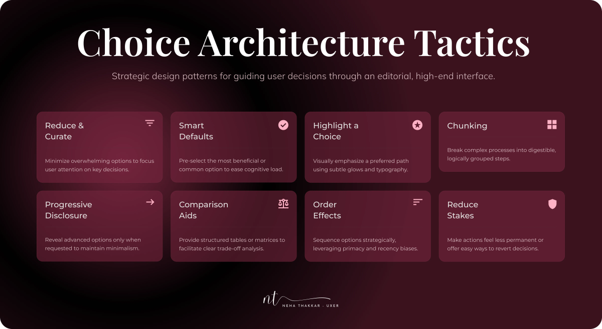
Choice architecture is the practice of deliberately designing how choices are presented to guide people toward good decisions without removing their freedom to choose. It's the antidote to decision paralysis, and done well, it improves user decision making at every step, turning anxious deliberation into confident action. Here are the most effective tactics, each with real product examples.
1. Reduce and curate the options
The simplest fix: offer fewer, better choices. Audit every decision point and ruthlessly cut options that don't earn their place.
- Apple famously sells a deliberately limited product line, a handful of iPhones, not forty. Choosing is easy.
- Netflix doesn't show you all 40,000 titles; it curates rows ("Top 10," "Because you watched…") to shrink the decision to a handful at a time, and even added a "Play Something" button to remove the choice entirely.
- In-N-Out thrives with a tiny menu while competitors overwhelm with hundreds of items.
Watch out: don't over-cut. Removing choices people genuinely need creates a different problem (more on this balance below).
2. Use smart defaults
A well-chosen default does the deciding for users who don't want to. Since people overwhelmingly stick with defaults (a powerful nudge from behavioral design), setting a sensible one removes the burden of choice.
- Software setup wizards that pre-select recommended settings.
- Subscription flows that pre-select the most popular plan.
- Google Docs defaulting to sensible formatting so you can just start typing.
3. Highlight a recommended choice
When you must show several options, point clearly to one. This gives hesitant users an easy out and reduces the evaluation burden.
- Pricing pages everywhere badge one tier as "Most Popular" or "Best Value" (the Von Restorff effect at work), and it becomes the anchor everyone gravitates to.
- Amazon's "Amazon's Choice" and "Best Seller" badges cut through thousands of options by saying "just pick this one."
- Spotify's Discover Weekly hands you a curated playlist so you don't have to choose from millions of songs.
4. Chunk and categorize
Group options into meaningful categories so users evaluate a few clusters instead of one giant list. Chunking respects working-memory limits.
- E-commerce filters and categories (by type, price, brand) let users narrow a huge catalog step by step.
- Navigation menus grouped into logical sections rather than one endless list.
- Settings organized into tabs instead of one overwhelming page.
5. Use progressive disclosure
Reveal complexity gradually. Show the essentials first, and hide advanced options until users need them. This keeps the initial decision simple without permanently removing power.
- "Advanced settings" toggles that hide rarely-used options.
- Onboarding flows that ask one question per screen instead of everything at once.
- Booking flows that reveal steps sequentially rather than dumping a mega-form on you.
6. Provide comparison aids
When choices are genuinely complex, help users compare rather than forcing them to hold everything in their heads.
- Side-by-side comparison tables on pricing and product pages.
- "Compare" features on electronics and SaaS sites.
- Clear, scannable differentiators so users instantly see how options differ.
7. Order options thoughtfully
Sequence matters. Thanks to the serial position effect, people remember the first and last items best, so place your most important or recommended options where they'll land.
- Menus leading with popular or recommended items.
- Plan lists ordered to anchor perception (often highest-to-lowest or with the recommended plan centered and emphasized).
8. Reduce the stakes and the friction
Lower the perceived risk of choosing, and make the choice reversible.
- Free trials, easy returns, and money-back guarantees shrink the fear of a wrong decision.
- "You can change this later" reassurances during setup.
- One-click undo so no choice feels permanent.
Do these well, and you transform a paralyzing wall of options into a guided, confident path.
The balancing act: don't oversimplify
Here's the nuance that separates thoughtful designers from those who take "reduce choices" too literally: the goal isn't the fewest possible options, it's the right amount of well-structured choice.
Strip away too much, and you create new problems. Users have real, diverse needs; remove a genuinely necessary option and you frustrate people, force awkward workarounds, or make your product feel limiting. This tension is captured by Tesler's Law (the conservation of complexity): every process has an irreducible amount of complexity, and if you hide it too aggressively, you either push it onto the user in another form or strip out something they needed.
Choice also provides a sense of autonomy and control, which people value. The aim of good choice architecture isn't to eliminate decisions but to make necessary decisions easy: reduce the pointless choices, structure the meaningful ones, and always guide without removing freedom. Curate, don't amputate.
This is also where understanding your users deeply pays off. Knowing the difference between what users say they want (all the options!) and what they actually need to succeed is central to getting this balance right, which is exactly the theme of our guide on User Wants vs. User Needs vs. Business Needs. And figuring out which choices genuinely matter to people is a job for real research, covered in UX Research Methods.
How to detect and diagnose decision paralysis
You don't have to guess whether decision paralysis is hurting your product. Investigate it:
Look at analytics. Find the screens with unexpected drop-off, long dwell times without progress, or high back-and-forth. Decision-heavy pages (pricing, plan selection, product grids) are prime suspects.
Run usability testing. Watch real users hit your decision points. Do they hesitate, sigh, ask "which should I pick?", or give up? Nothing reveals paralysis faster than watching someone experience it. (See Usability Testing 101.)
Use surveys and feedback. Ask users where they felt confused or overwhelmed. "Was anything hard to decide?" surfaces paralysis directly.
A/B test simplifications. Test a reduced or better-structured set of choices against the original. The jam study repeats itself constantly in real product experiments, simpler often wins.
Grounding your fixes in research and data (rather than assumptions) is what turns "I think this is too complex" into "here's proof, and here's the version that converts better." This diagnostic mindset connects directly to a solid UX design thinking process, define the real problem before you redesign the solution.
Common mistakes when tackling decision paralysis
- Confusing "more features" with "more value." Piling on options to look generous or competitive often backfires into paralysis. Value comes from helping users succeed, not from a longer list.
- Oversimplifying to the point of frustration. Cutting genuinely needed choices creates a new problem. Balance is everything.
- Hiding the recommended path. If you offer options but don't guide users to one, you've left them to do all the hard evaluation themselves.
- Ignoring the emotional side. Decision paralysis is partly about fear of regret. Reassurance, reversibility, and social proof address the emotion, not just the logic.
- Designing from assumption, not evidence. What feels "simple enough" to you (the expert who knows the product) may overwhelm a first-time user. Validate with real people.
- Forgetting the bigger picture. Reducing decision paralysis serves the user and the business, but only when it aligns with genuine user needs and product goals, not just short-term conversion tricks.
Key takeaways
- Decision paralysis is when too many, or too complex, choices overwhelm users into hesitation or inaction. It's a quiet but serious conversion and satisfaction killer.
- It's driven by well-documented UX psychology: choice overload (the paradox of choice and the jam study), cognitive load, Hick's Law, and the fear of making the wrong choice, all of which shape user decision making in your product.
- Fight it with choice architecture: reduce and curate options, use smart defaults, highlight a recommended choice, chunk and categorize, apply progressive disclosure, add comparison aids, order options thoughtfully, and lower the stakes.
- Don't overcorrect. The goal is the right amount of well-structured choice, not the fewest possible options. Curate, don't amputate, and preserve users' sense of autonomy (remember Tesler's Law).
- Diagnose with evidence: analytics, usability testing, surveys, and A/B tests reveal exactly where paralysis lives and prove which simplification wins.
Great UX isn't about giving people everything. It's about making the right decision feel effortless. When you design choices that respect human limits, you don't restrict your users, you free them. And a user who can decide with confidence is a user who converts, stays, and comes back.
Frequently asked questions
Decision paralysis in UX is when users are faced with too many options, or options that are too complex, and become overwhelmed to the point of hesitating or not deciding at all. It's caused by choice overload and high cognitive load, and it often leads to abandonment, lower conversions, and reduced satisfaction.
The main causes are too many options, options that are hard to compare, too much information, no clear default or recommendation, high perceived stakes (fear of choosing wrong), and unclear next steps. Almost all of them come down to poor choice architecture, the way choices are structured and presented.
Use choice architecture tactics: reduce and curate the number of options, set smart defaults, highlight a recommended choice, chunk options into categories, use progressive disclosure to reveal complexity gradually, provide comparison aids, order options thoughtfully, and lower the stakes with reversibility and reassurance.
The paradox of choice, popularized by psychologist Barry Schwartz, is the idea that while some choice is good and motivating, too much choice becomes overwhelming and demotivating. The famous jam study demonstrated it: a display of 24 jams attracted more browsers but produced far fewer purchases than a display of just 6.
No. The goal is the right amount of well-structured choice, not the fewest possible options. Removing genuinely needed choices frustrates users and can violate Tesler's Law (the conservation of complexity). Good design curates and structures choices and guides users toward good decisions, without stripping away meaningful control.
Cognitive load is the mental effort a task requires, and human working memory is very limited. Every additional option and piece of information increases cognitive load. When the load exceeds what users can comfortably process, they experience decision paralysis and default to the easiest action, which is often no action at all.