Manoratham
A homely villa stay tucked into the mountains of Dharamshala, given a website that feels like the place itself: warm, cosy, and unhurried.
Visit the live site- Services
- Website Design
- Tools
- Framer, Figma
- Timeline
- One week
- Value
- Premium hospitality
Translating a place into a screen
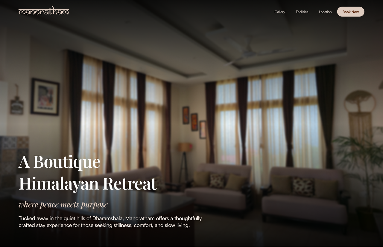
Manoratham is a villa stay in the mountains of Dharamshala, a home away from home, cosy and unhurried, the kind of place people go to when they want to slow down. The brief was deceptively simple: create a digital experience that reflects the calm, soulful essence of the villa, where nature, comfort, and design coexist in harmony.
The difficulty is that a homely feeling is not a feature. Most stay websites rush you toward a booking. This one had to do the opposite first: make you feel at home in the mountains, and only then, gently, offer a way to stay. All of it inside a one-week sprint.
Most stay websites rush you toward a booking. This one had to make you feel at home first.
Minimalism, and emotion-driven storytelling
The strategy was restraint. Soft earthy tones, generous white space, and flowing imagery, each page built to immerse rather than inform. The design leans on photography and air, letting the villa speak before the copy does.
Underneath the calm, the navigation stays intuitive. A guest can drift through the interiors and landscape, or move straight from discovery to booking without friction. Emotion sets the mood; usability keeps its promise.
A palette borrowed from the villa
The colours were pulled from Manoratham itself: cream walls, pine slopes, terracotta clay, river stone. Warm, muted, and quiet, so the imagery always stays the loudest thing on the page.
Tones pulled from the villa itself: cream walls, pine slopes, terracotta clay, river stone.
Manoratham, a soulful Himalayan escape where nature, comfort, and design quietly coexist.
Type follows the same logic. Playfair Display, a quiet serif, carries the lines meant to be felt; Satoshi, a clean geometric sans, handles everything a guest needs to read, dates, rooms, rates, directions. The Manoratham wordmark itself is set in Samarkan, a Devanagari-styled display face that roots the brand in its Himalayan place.
Every page, an immersion
Each screen was composed to place the visitor inside the experience, leading with interiors, landscape views, and the villa's distinct character, rather than with forms and facts.
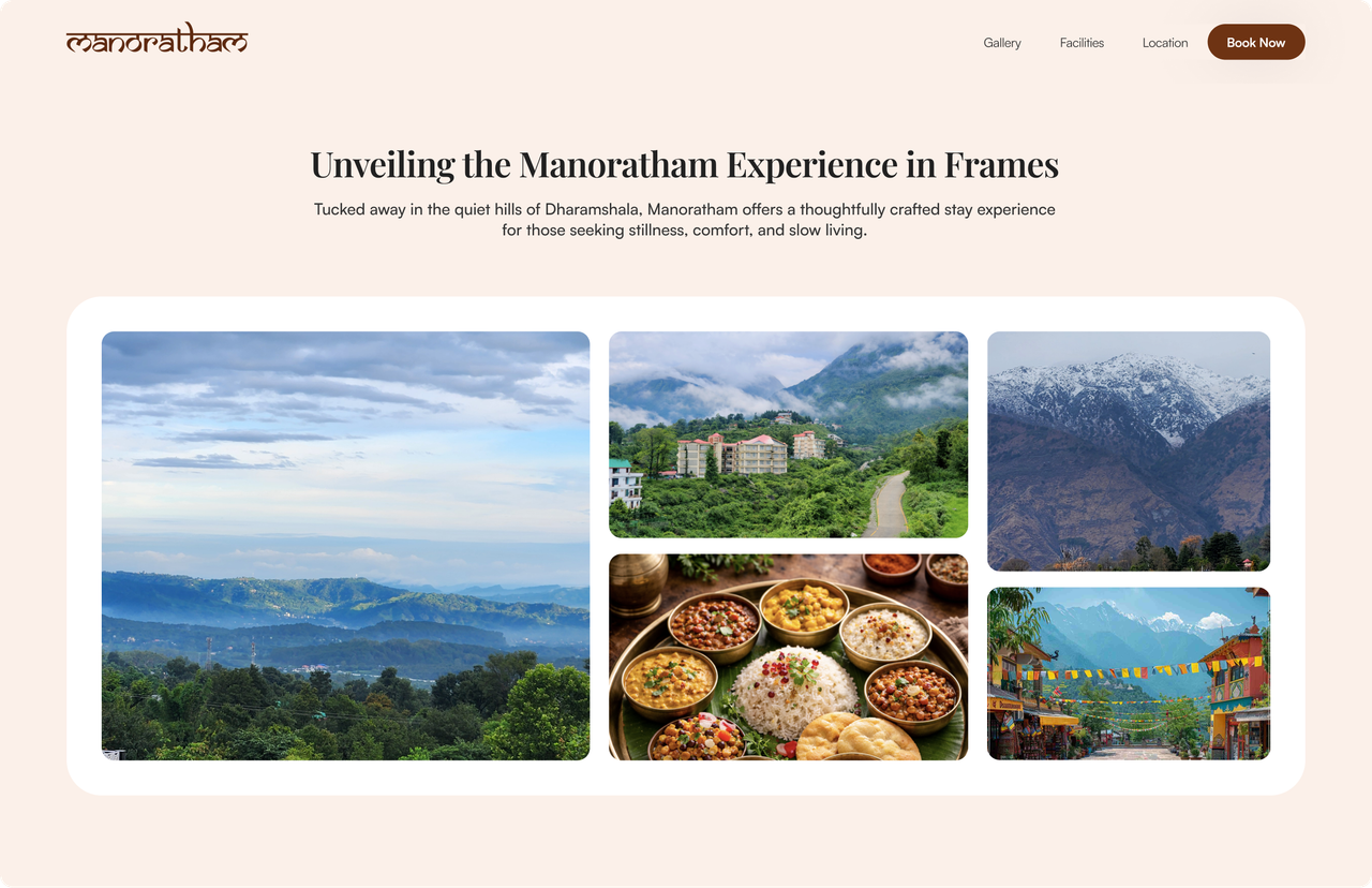
Every page, an immersion, tap through the live screens.
From first breath to booked
The path from landing to reservation was kept calm and short, four unhurried moments rather than a funnel to push through.
Tap through the four moments
Built to be felt, not clicked through
Because the site was built in Framer, motion is part of the message. Imagery drifts into view as you scroll, sections settle rather than snap, and the whole page breathes at the pace of the place it represents.
An invitation, not just an interface
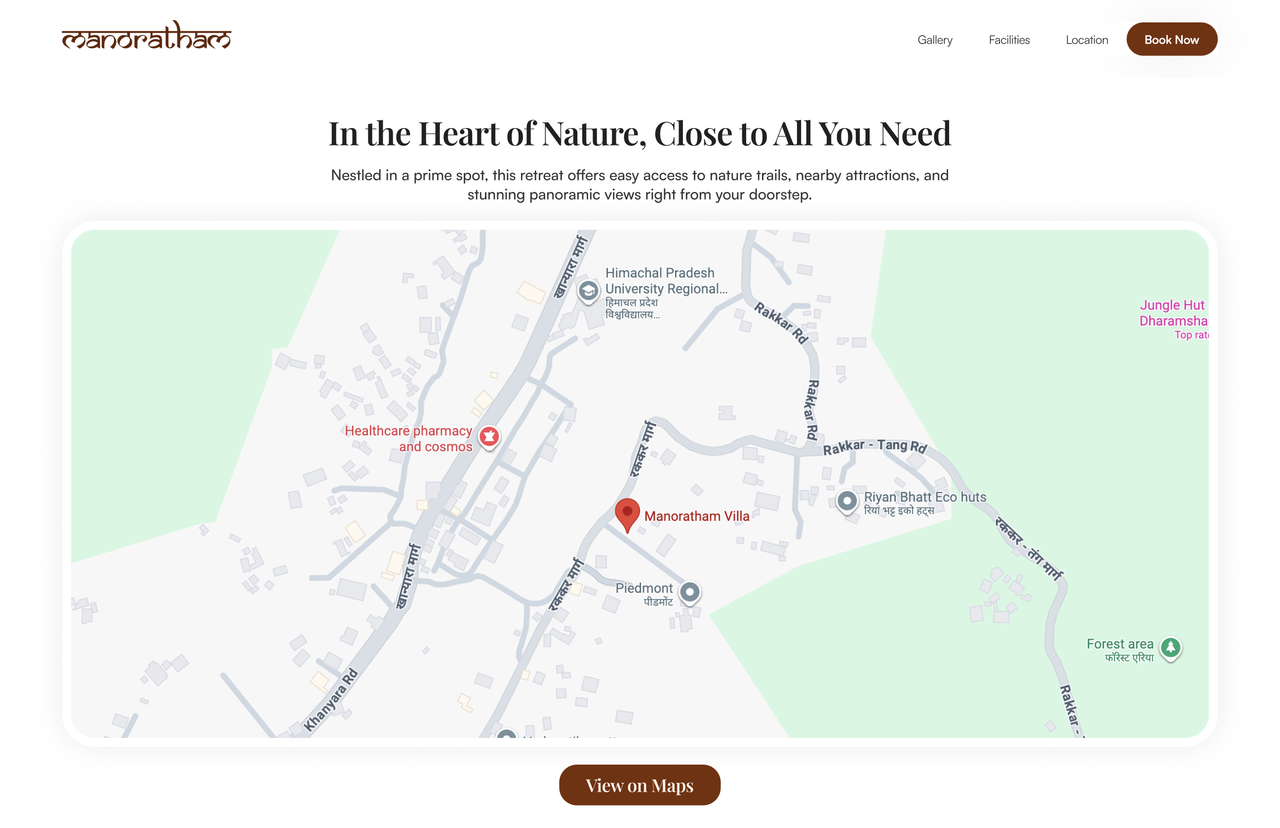
The result is a website that works as more than a booking tool. By merging aesthetic appeal with usability, it translates the villa's homely philosophy into an emotional journey, an invitation to experience the stillness and beauty of Dharamshala.
See the finished experience for yourself: villa.manoratham.com ↗
What a one-week sprint reinforced
Feeling is the feature.
For a place that sells calm, the design's first job was to make you feel it, not to list amenities.
Restraint reads as luxury.
Earthy tones, white space, and few words let the villa, and the guest, breathe.
Constraints sharpen decisions.
A single week left room only for the choices that actually carried the mood.
Emotion and usability are not a trade.
The site feels unhurried and still moves a guest cleanly from discovery to booking.