“We didn’t just make it healthier.
We made it crunchier.”
A full brand identity for Atuva, a freeze-dried fruit & veg crisp brand: the strategy, the wordmark, a plum-and-fruit colour system, and a pack die-cut into the produce inside it. This is how it came together.
- Role
- Brand Identity & Packaging
- Deliverable
- Brand system + guidelines
- Category
- Branding & Identity
- Year
- 2026
Fruit and veg didn’t lose on nutrition. They lost on crunch.
Before any colour or logo, there was one question to settle: why does anyone walk past fruit? Not because they weighed up their health and chose against it, but because chips are crunchy, dry, hand-held and ready, while everything that grows needs washing, cutting, a fridge, and eating before Thursday.
That reframed the whole brief. This was a format problem, not a willpower problem, so the brand had to fix the format and leave the food completely alone: real fruit and vegetables, freeze-dried until they crunch. One ingredient, no fridge, no spoiling, no sticky hands. Crunch over cure became the lens for every decision after it.
The real competitor was never other healthy snacks. It was the packet of chips someone almost reached for instead.
We didn’t just make it healthier. We made it crunchier.
One line had to carry the whole strategy, so it was worth pulling apart until it did two jobs at once. Crunch is the reason to try, immediate, sensory, and describable to a friend in a single sentence. Range is the reason to return, because crunch is copyable within a year, but okra, chikoo and dragonfruit under one brand is not.
Kept in plain kitchen language and in denial form, it was already healthy, just made crunchy, it stays concrete and sidesteps claim risk. From there, every design decision had to earn its place against that single promise.
Real fruit and veg. One ingredient.
It was already healthy. We made it crunchy.
It crunches, and that is the whole point.
Plain, concrete, sensory, and it carries no claim risk.
A pack shaped like the produce inside
The decision that mattered most was a single rule, and it became the brand's primary distinctive asset: every pack is die-cut in the silhouette of the fruit it holds. A strawberry pouch is strawberry-shaped, leafy crown and all. One Hero colour carries the flavour and the plum block carries the brand, so the shape itself does the talking on shelf.
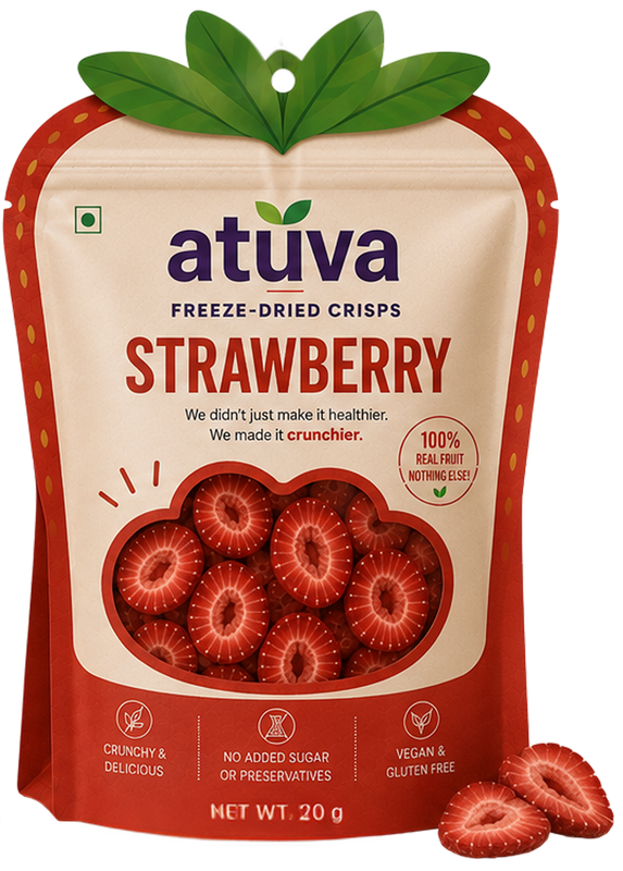
Every pack is cut in the silhouette of the fruit inside it.
One Hero colour per pack, one die-cut shape per fruit. Pick a flavour and watch the pack become it.
The rule had to survive real production, so it runs across three formats: a 5g flat pouch for the kirana hook-strip, a 10g flat pouch as the main SKU, and a 20g contour-cut stand-up with a zipper. Tying the die to the fruit rather than the size lets the shape scale without multiplying tooling.
One plum, six fruits, rosy sands
The hardest constraint was making very different packs still read as one brand. The answer was to anchor everything to a single Atuva Plum, present on every pack regardless of flavour, sitting at the deep, desaturated end of the same arc as the fruit. Each flavour then gets exactly one Hero accent, never two, because the real risk isn't colours clashing, it's using them all at once and reading like a discount carnival.
600 is the brand block on every pack, constancy is what makes four loud packs read as one brand.
StrawberryEven the neutrals lean rosy rather than beige. A warm beige shares a hue with Pineapple and would look like a washed-out flavour, so the sands sit on the plum side of the arc instead, reading as quiet relatives of the brand colour.
A wordmark you’re not allowed to re-typeset
The mark is lowercase so it reads friendlier, with two leaves growing out of it where a fruit's leaves would sit, a universal cue for produce. The fiddly hours went where brands are quietly won: optical corrections baked into the vector so the round letters overshoot, the v narrows, and the descriptor sits by eye rather than by rule. The one rule for everyone downstream, never rebuild it from the font file, always place the supplied asset.
Plum 600 wordmark, level, on a Shell ground.
Reads friendlier; the round bowls give the mark something to sculpt.
A universal visual cue for fruit, sprouting where a fruit's leaves would.
Stroke ends share the pack's minimum die radius, one corner logic.
Two families, three roles
Bricolage Grotesque carries the logo, headlines and flavour names; Lato handles body copy and the nutrition panel's tabular figures. Both were chosen deliberately for being open-source and free for commercial use including packaging, so the brand can scale across SKUs without a licence bill quietly draining it.
Strawberry, freeze-dried until it crunches. One ingredient, nothing to read twice.
372 kcal · 4.1 g protein
Five traits, and a trap
To keep the brand from drifting as it grows, it comes down to five traits and a test: if a piece of work doesn't carry at least three of them, it isn't Atuva yet. The trap to guard against is childishness, the moment playfulness turns into mascots or baby-talk, the price ceiling drops and the adult occasion is gone. So the play lives in shape, colour and wit, never in talking down.
Naturally indulgent is the one that does the work, wholesome without it reads worthy; indulgent without it reads like confectionery.
Everything that grows
The range runs in three tiers so it can earn its keep and still surprise. Familiar produce pays the bills, Indian produce builds distinctiveness, and the unexpected tier is the reason anyone tells a friend. One line held firmly: vegetables are not a sub-brand, under Atuva a vegetable is simply a chip.
This tier is the brand. It proves the crunch promise on things nobody expects, and generates the word of mouth.
The first tier pays the bills, the second builds distinctiveness, the third is the reason anyone tells a friend.
The crunch is the product
The art direction follows one idea, the crunch is the product, so photography exists to make texture visible: macro-close, broken edges and shards, natural irregular slices, soft directional shadows on a clean Shell or sand ground. Water droplets and syrup styling are ruled out because the product is dry, and props never outnumber it. Lifestyle is real hands in real Indian contexts, the product being eaten, not displayed.
- ✓Macro-close enough to see the structure
- ✓Visible crunch, broken edges, shards
- ✓Natural, irregular slices
- ✓Soft directional shadows
- ✓Clean Shell or sand backgrounds
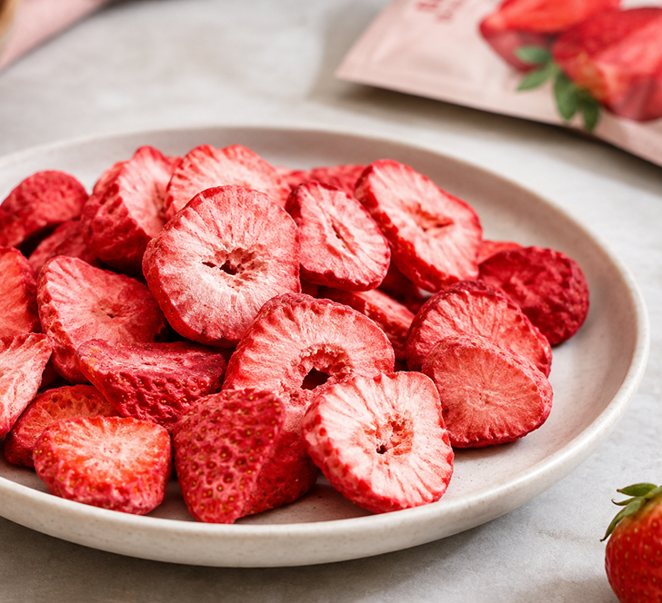
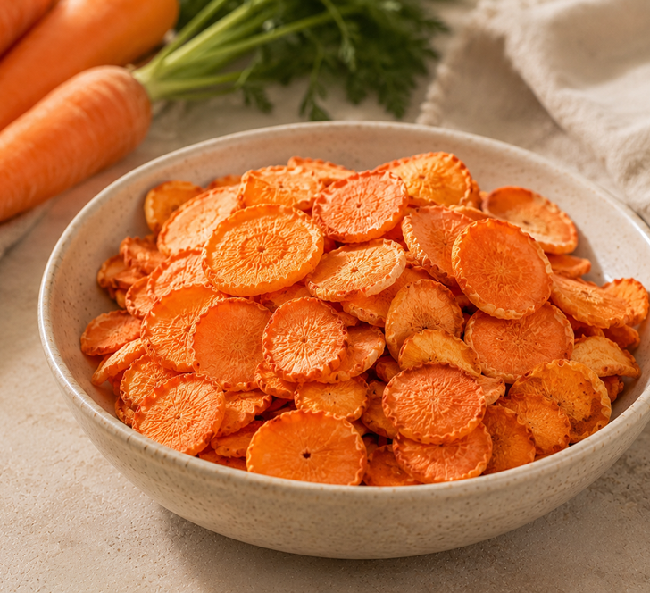
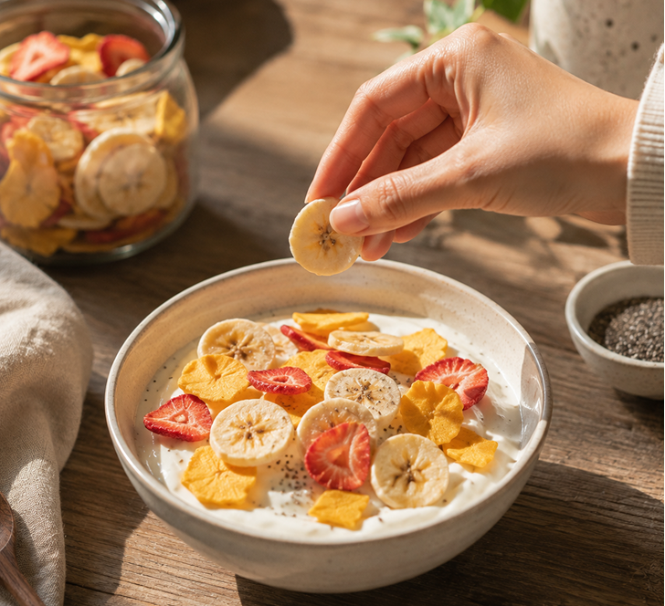
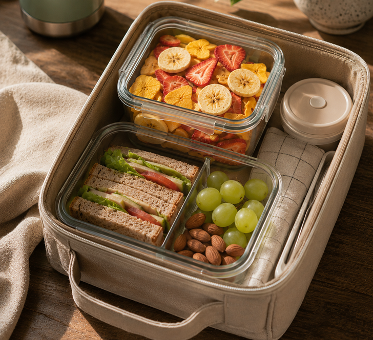
Shot right: macro, dry, and honest.
Loud packs, one brand
Pulled together, every part does one job: the plum block, the Hero accents, the die-cut silhouette and the leaf-topped wordmark let a shelf of very different flavours read instantly as one family. The distinctiveness is structural rather than decorative by design, because that is what lets it hold as the range grows from strawberry to bitter gourd.
Distinctiveness beats decoration.
A die-cut silhouette and a constant plum block do more to build recognition than any surface pattern could.
Constraints keep it coherent.
One Hero per pack, only Plum 600 for the mark, rosy sands not beige, the rules are what let six loud packs read as one brand.
The strategy is the design.
“We made it crunchier” decides the photography, the copy, and even which fruits earn a place in the range.
Build for scale.
Open-source type and a one-die-per-fruit logic let the system grow from strawberry to bitter gourd without breaking.